
| 일 | 월 | 화 | 수 | 목 | 금 | 토 |
|---|---|---|---|---|---|---|
| 1 | 2 | 3 | ||||
| 4 | 5 | 6 | 7 | 8 | 9 | 10 |
| 11 | 12 | 13 | 14 | 15 | 16 | 17 |
| 18 | 19 | 20 | 21 | 22 | 23 | 24 |
| 25 | 26 | 27 | 28 | 29 | 30 | 31 |
- 백준
- 스토리북
- Storybook
- 기본 수학 2단계
- SASS
- algorithm
- 니모닉
- 리액트
- 블록체인
- C++
- bip39
- priority queue
- TypeScript
- Mnemonic
- React
- baekjoon
- SVG
- 기본수학1단계
- three.js
- 알고리즘
- 우선순위 큐
- 지갑
- scss
- 풀이
- Console
- 에러
- 코딩
- 프로그래밍
- frontend
- Blockchain
- Today
- Total
Moong
[React+Typescript] Storybook 도입하기 본문
프론트 코드를 짜다 보면 하나의 UI를 확인하기 위해 여러 동작을 수행해야 하는 경우가 있습니다.
예를 들어 회원가입 완료 모달을 보기 위하여 특정 변수를 조작하거나, 회원가입 과정을 직접 해보아야 하는 번거로운 과정을 겪어야 합니다.
storybook은 이러한 번거로움 없이 독립적인 환경에서 UI를 테스트 할 수 있도록 하는 유용한 툴입니다.
storybook 도입 이유
- 독립적인 환경에서 UI 테스트
- 더 나은 컴포넌트 설계를 고안하게 됨
- 리팩토링 효과
설치 방법
react 프로젝트 root 경로에 다음 명령어를 입력해줍니다.
(storybook 버전 7.0.7 기준으로 작성된 글입니다)
npx storybook@latest init
storybook 실행
# npm
npm run storybook

# yarn
yarn storybook
명령어를 통해 http://localhost:6006 에서 실행된 sotyrbook을 볼 수 있습니다!

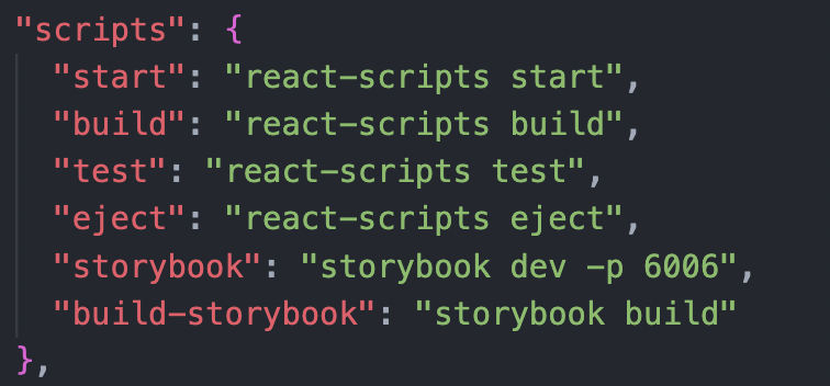
➕ port를 바꾸고 싶은 경우
package.json > scripts > storybook > 6006 대신 원하는 포트 번호로 지정해주면 됩니다.
storybook 작성하기
src > stories > Button.stories.tsx
meta
▪️ title : storybook의 폴더 경로 및 파일 이름 지정
▪️ component : storybook에서 다룰 component
▪️ tags : autodocs를 추가하면 컴포넌트에 작성한 기반으로 문서가 자동생성됨
▪️ decorators : 컴포넌트를 감싸는 element를 지정할 수 있음 (추후 자세히 설명)
▪️ argTypes : 컴포넌트 props의 type을 명시 - colors, date 등 다양(참고 링크)
Story
▪️ args : 컴포넌트에 전달할 props값 명시
▪️ render : 컴포넌트를 렌더링 / hook을 이용하여 rendering할 때 사용
// Buttons.stories.tsx
import type { Meta, StoryObj } from '@storybook/react';

import { Button } from './Button';

// satisfies Meta<typeof Header> 을 다음과 같이 변경해주면
// 에러가 나지 않습니다
const meta : Meta<typeof Button> = {
  title: 'Example/Button',
  component: Button,
  tags: ['autodocs'],
  argTypes: {
    backgroundColor: { control: 'color' },
  },
};

export default meta;
type Story = StoryObj<typeof meta>;

export const Primary: Story = {
  args: {
    primary: true,
    label: 'Button',
  },
};

export const Secondary: Story = {
  args: {
    label: 'Button',
  },
};

export const Large: Story = {
  args: {
    size: 'large',
    label: 'Button',
  },
};

export const Small: Story = {
  args: {
    size: 'small',
    label: 'Button',
  },
};
✍️ storybook component에 hook 적용하기
클릭 이벤트에 따라 props의 값을 바꿔주어야 할 때
다음과 같이 useState와 render을 이용하여 작성하면 됩니다!
버튼을 클릭할 때마다 버튼 size가 바뀌는 예제입니다.
// Button.stories.tsx
const ButtonWithHook = () => {
  const sizeList = ['small', 'medium', 'large'] as const;
  const [count, setCount] = useState(0);
  return <Button
    size={sizeList[count%sizeList.length]}
    label='Button'
    onClick={()=>setCount(count+1)}
  />
}

export const ButtonSizeHandler: Story = {
  render : () => <ButtonWithHook />
}
✍️ storybook 문서 작성하기
story 파일에 meta의 tags 부분을 autodocs로 지정해주면
태그를 기반으로 story 문서가 생성됩니다.
// Button.stories.tsx

...
const meta : Meta<typeof Button> = {
  title: 'Example/Button',
  component: Button,
  tags: ['autodocs'], // 이부분!
  argTypes: {
    backgroundColor: { control: 'color' },
  },
};
...
Buttons.tsx 컴포넌트 파일에 주석 작성하기
// Button.tsx
import React from 'react';
import './button.css';

interface ButtonProps {
  /**
   * 버튼의 primary 여부
   */
  primary?: boolean;
  /**
   * 버튼의 배경 색상
   */
  backgroundColor?: string;
  /**
   * 버튼의 크기
   */
  size?: 'small' | 'medium' | 'large';
  /**
   * 버튼 내용
   */
  label: string;
  /**
   * 부가적인 클릭 이벤트입니다
   */
  onClick?: () => void;
}

/**
 * 기본 버튼 UI 컴토넌트입니다.
 */
export const Button = ({
  primary = false,
  size = 'medium',
  backgroundColor,
  label,
  ...props
}: ButtonProps) => {
  const mode = primary ? 'storybook-button--primary' : 'storybook-button--secondary';
  return (
    <button
      type="button"
      className={['storybook-button', `storybook-button--${size}`, mode].join(' ')}
      style={{ backgroundColor }}
      {...props}
    >
      {label}
    </button>
  );
};
결과 화면

다음 글에는 storybook을 도입하면서 겪었던 에러들, 또 설정해주면 유용한 사항들에 대해 이야기 해보겠습니다!
그럼 제 글이 도움이 되었길 바라며 이만 마치겠습니다 🍅
참고 링크
Storybook 시리즈
'React' 카테고리의 다른 글
| [React+Typescript] Storybook에 라우터(react-router-dom) 설정하기 (0) | 2023.05.04 |
|---|---|
| [React+Typescript] Storybook에 sass 설정하기(sass 에러 나는 경우) (0) | 2023.05.04 |
| [React+Typescript] Storybook에 Redux 설정하는 법 - could not found react-redux context value 에러 해결 (0) | 2023.05.03 |
| [React+Typescript] Storybook 에러 해결법 - element type is invalid (0) | 2023.05.03 |
| [React] Notification custom hook 만들기 - 알림 아이콘, 알림음 설정 (0) | 2023.04.19 |


